

Alpa Holding
About the Project:
A bilingual corporate website for Alpa Holding, a Damascus-based investment group operating across seven strategic sectors, from logistics to hospitality.
The site had to present a diversified group as one coherent ecosystem, giving partners, investors and job seekers a clear view of its companies, governance and direction. We designed a premium, gold-accented identity in Arabic and English and organised the content around the group's sectors and the companies that operate within each one.
What We Built
We structured the website as a focused corporate portal: a home page that summarises the group, dedicated pages for its story and its business, and practical pages for careers, news and contact.
- Home: hero, ALPA at a Glance figures, the investment portfolio, the integration model, leadership and the latest news
- Who We Are: the group's vision, its four strategic phases of growth, six core values and a leadership and board section
- Our Business: the group's companies grouped by sector, from real estate development and contracting to hospitality, mobility and logistics, and food industries
- Careers: reasons to join, a four-step hiring process, open positions and an invitation to join the talent network
- Insights: the group's news, press releases and initiatives
- Contact Us: department email addresses, a phone number and an inquiry form
Key Features
- Full Arabic and English versions with a language switcher in the header
- An interactive portfolio map that places the group's eleven companies around a central globe, each linked to its sector on the Our Business page
- Animated key figures for the group's workforce, sectors and headquarters
- A four-step Investment Integration Model: investment, development, engineering and construction, and operations
- Footer links that jump straight to each business sector
- Job listings showing location and contract type, with an Apply Now button that opens an email to the HR team
- A direct link from the hospitality sector to the Dama Rose hotel website
- Separate contact channels for careers, general inquiries and sales
Design & User Experience
We paired deep black and charcoal sections with warm white panels and gold accents, a palette that signals stability and prestige without feeling heavy. Headings use an elegant serif typeface topped with small, widely spaced gold labels, while body text stays light and readable. Rounded cards, dark tiles for the integration steps and photography of the group's offices and boardroom give the site a confident institutional presence. The layout adapts to phones and tablets, and the Arabic version reads right to left.
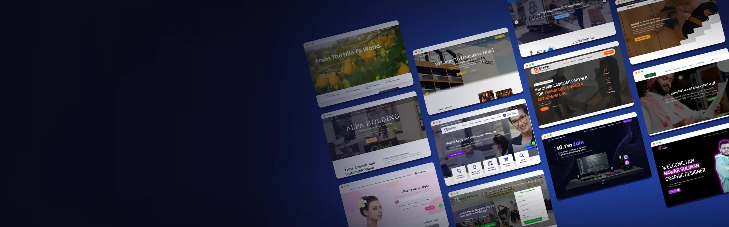
Website Preview:
Hover over the image to preview the page, or click to explore it in full.