
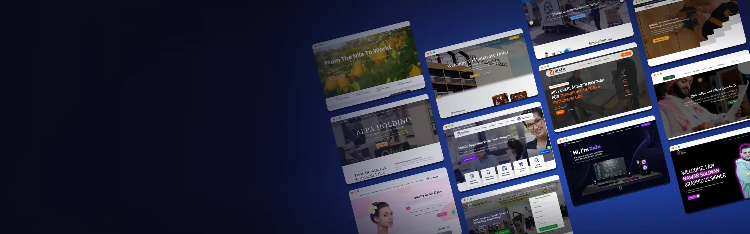


Nawar Portfolio
About the Project:
A personal portfolio for graphic designer Nawar Suliman that presents his logos, menus, roll-ups and brand mockups and invites new collaboration requests.
Nawar needed a site with as much character as his work. We built a dark, bold portfolio with a neon purple glow, organized his work into chapters, and gave each brand he designed its own case-study page.
What We Built
The English-language main page moves from a personal hero through his story, experience and portfolio chapters to a contact form, and a separate projects section holds a page for every brand.
- Hero: "Welcome, I am Nawar Suliman, Graphic Designer" beside his portrait, with a Contact Me button
- About Me: a short bio covering brand identity, logos, brochures, posters, menus and social media content, with a CV download
- Experience: his roles in advertising, printing and health care, his freelance work, the design tools he uses and his languages
- Chapter One, Logo Design: full-width banners for brands such as Dopa Tech, Laure, Saja, Shawarma Loaf, Ocean and Almoayed World
- Chapter Two, Promotional Designs: one-page and multi-page menus, roll-ups, business cards, brand mockups and social media posts
- Projects: a list of brand case studies, each with a project brief and its category, year and country
Key Features
- A downloadable PDF CV
- Dropdown menus that jump straight to each portfolio category or brand project
- A logo showcase where each brand sits on a full-width photo banner with its name, year and field
- Galleries with arrow controls for menus and brand mockups
- Case-study pages that explain the idea behind a mark, such as Saja's logo combining a face with a lotus flower
- A contact form with a "Send Now" button
- Direct links to WhatsApp, Telegram, Facebook, Instagram, LinkedIn, phone and email
Design & User Experience
We kept the background dark, close to black, and framed Nawar's portraits in a neon purple glow, with the same purple on buttons and key words so the page feels as confident as the designer. Large faded chapter numbers (01, 02) split the work into clear chapters, and two-tone uppercase headings such as "Brand Logos" and "Roll Ups" make the hierarchy easy to follow. Real photographs behind each logo banner place every brand in context, so the work is shown the way clients would see it.
Website Preview:
Hover over the image to preview the page, or click to explore it in full.