

Softrase
About the Project:
A corporate website for Softrase, a Mannheim software company that builds websites, mobile apps, web apps and online stores, in German, English and Arabic.
Softrase offers a wide range of digital services, so the site had to explain each one clearly and lead visitors toward a free consultation. We structured it around detailed service pages, real project references and a short path to contact, and delivered it in three languages with a full right-to-left Arabic version.
What We Built
The site pairs a long, section-based home page with dedicated pages for every service, a filterable portfolio, a blog and a contact page. Dropdown menus list all services, portfolio categories and the latest articles, so any page is one click away.
- Home page: hero slider, service shortcuts, about teaser, a three-step "how we work" section, client testimonials, latest blog posts, FAQ and a contact form
- Services: twelve service pages, from website and app development to SEO, graphic design, AI, database and cloud solutions, each with in-depth content and its own FAQ
- Portfolio: project references grouped into websites, web apps and mobile apps, each with a detail page, project description and image gallery
- About us: mission, vision and values, the company story and a four-step path from first message to project start
- Blog: articles on current software and web technology news
- Contact: inquiry form, address, email, phone, opening hours and an embedded Google map
Key Features
- Language switcher for German, English and Arabic, with the Arabic version laid out right to left
- Contact form with a dropdown for choosing the required service, plus spam protection
- Phone number in the header and a WhatsApp button for quick messages
- Filter tabs that sort the portfolio into websites, web apps and mobile apps
- Expandable FAQ sections on the home page and on the service pages
- Carousels for services, projects and client testimonials
- "Free consultation" calls to action repeated across the site
- Cookie consent banner, legal pages and an accessibility statement
Design & User Experience
We built the visual identity on a clean white base with violet and blue accents, and deep navy sections that separate the main blocks of content. 3D-style service illustrations sit alongside team photography and project screenshots, and rounded cards with icons keep the long pages easy to scan. Sliders and carousels add motion without hiding content, the layout adapts to phones, tablets and desktops, and the Arabic version mirrors the whole interface for right-to-left reading.
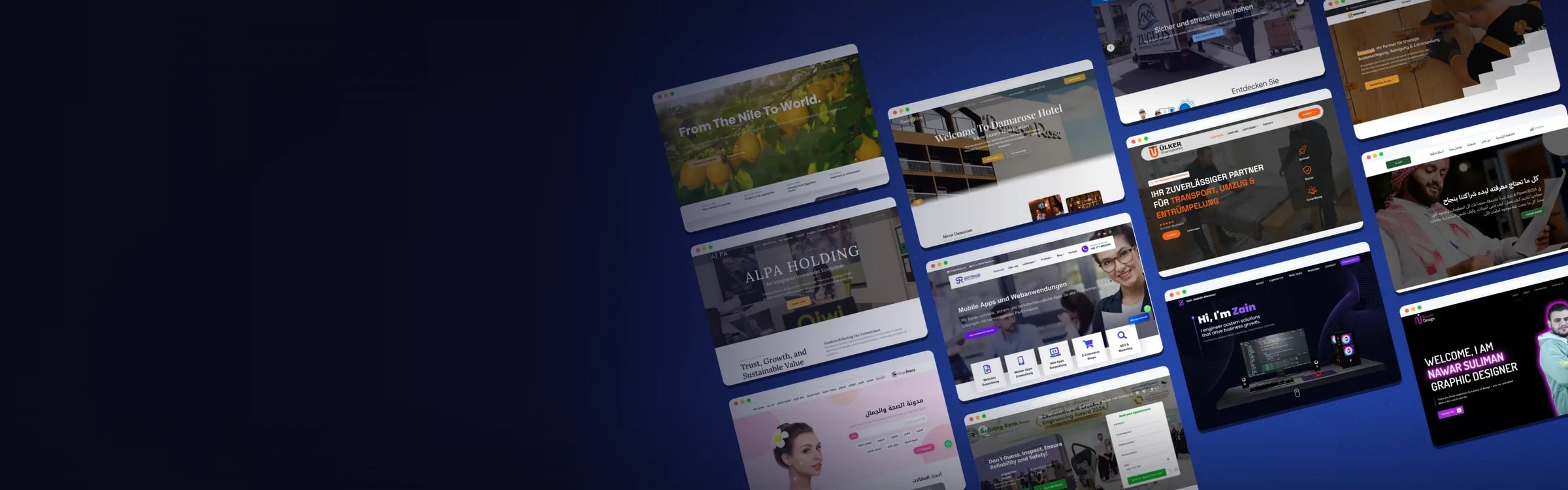
Website Preview:
Hover over the image to preview the page, or click to explore it in full.