

Ülker Transporte
About the Project:
A German website for Ülker Transporte, a Mannheim logistics company offering transport, moving and house clearance with its own modern truck fleet.
The site needed to present a hands-on, family-run transport company as reliable and easy to book, for private customers and businesses alike. We kept the structure lean, put real photos of the team and vans at the center and placed a contact option in every section, so a free quote is never more than a click away.
What We Built
The site is built around the company's three core services, with a home page that answers the questions customers ask before booking and focused inner pages for each topic.
- Home page: hero with the company's promise, an about teaser, service cards, animated key figures, "why choose us", a three-step process, FAQ and a contact form
- About us: who the company is, its own truck fleet, fixed contact persons, transparent pricing, Germany-wide coverage, and its vision and mission
- Services overview: cards for transport, moving and house clearance
- Service pages: Transporte, Umzug and Entrümpelung, each explaining what is included, how the job runs and answering common questions
- Contact: contact form, phone, email, address and an embedded Google map
Key Features
- Contact form with first name, last name, email, subject and message
- Click-to-call phone number and email links
- A highlighted "Kontakt" button in the header on every page
- Animated counters for satisfied customers, completed trips and trucks in the fleet
- Expandable FAQ on the home page and the service pages
- Step-by-step blocks that explain how a job is planned and carried out
- Scroll-to-top button and links to the company's social media
Design & User Experience
We built the look around the brand's strong orange set against charcoal and white, echoing the logo and the livery of the company vans. Real photos of the team loading furniture and boxes replace stock imagery, which makes the business feel tangible and trustworthy. A floating rounded header, bold uppercase headlines, orange icon badges and clean cards keep the pages energetic yet orderly, and every section stacks neatly on mobile.
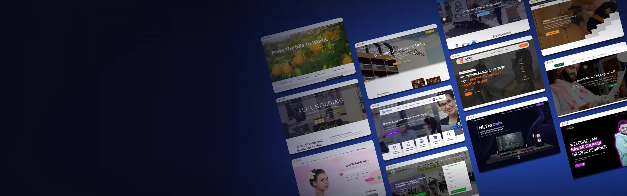
Website Preview:
Hover over the image to preview the page, or click to explore it in full.